
Identifying the Visual Triggers That Make a Work Look Chaotic

A work rarely looks chaotic because it contains “too much.” It looks chaotic because the eye cannot find a stable way to read what is there. Plenty of rich, dense, energetic works feel ordered. By contrast, a sparse work can feel visually disordered if its parts fight for attention, direction, scale, or meaning.
The useful question is not “Is this busy?” The sharper question is: Which precise conditions are creating disorder, and how can they be excluded?
That shift matters. Chaos becomes easier to prevent when it is treated as a set of visible triggers, not a vague flaw.
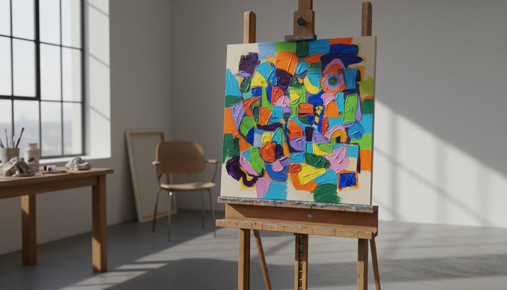
Chaos begins when hierarchy collapses
Visual order depends on hierarchy. The viewer needs to sense what matters first, what supports it, and what can be read later. When every element claims equal importance, the work becomes loud without becoming clear.
This can happen through:
Similar sizes across too many elements
Equal contrast everywhere
Repeated focal points with no clear winner
Details placed with the same intensity from edge to edge
A painting with five bright red forms, three hard black diagonals, and a field of tiny marks may contain strong parts. The problem appears when all of them shout at the same volume.
To exclude this trigger, choose a clear visual lead. That lead might be the largest shape, the sharpest contrast, the brightest color, or the most detailed area. Then reduce the force of nearby competitors.
A work can contain many parts, but it should not contain many masters.
Direction becomes disorder when forces cancel each other
Every line, edge, gesture, gaze, and repeated shape sends the eye somewhere. Visual disorder grows when these directions contradict each other without purpose.
A diagonal pulls one way. A curve redirects the eye. A row of marks creates rhythm. A hard vertical can stop movement. None of these are problems by themselves. They become chaotic when the viewer is pushed, stopped, reversed, and scattered too quickly.
This is common in compositions that combine many strong directional cues:
Sharp diagonals in several directions
Repeating arrows, points, or limbs with no shared flow
Cropped forms that lead the eye out of the frame
Patterns that move against the main subject
The fix is not to remove all movement. Movement gives a work energy. The fix is to determine the main route through the work and make secondary directions serve it.
A strong composition often acts like a path. It may curve, pause, and branch, but it does not leave the viewer stranded.

Contrast creates noise when it has no priority
Contrast is one of the strongest tools in visual work. Light against dark, rough against smooth, large beside small, warm near cool, all can create clarity. Trouble starts when contrast appears everywhere at once.
High contrast carries a visual demand: “Look here.” If the entire surface keeps making that demand, the viewer receives no useful instruction.
Color often causes this problem. A palette may contain exciting relationships, but if every hue is saturated, every edge is sharp, and every area changes value abruptly, the work has no quiet zone. The eye tires because it cannot rest.
Use contrast with rank. Reserve the strongest contrast for the place of greatest importance. Let other areas speak more softly.
A practical test helps: blur your eyes or step back. If the whole work vibrates as one restless field, contrast may be overactive. If one or two areas still hold command, the contrast structure is probably working.
Spacing fails when intervals feel accidental
Spacing shapes visual rhythm. Even forms that look unrelated become connected through distance. When intervals vary without intent, the work can feel jumpy and unresolved.
This kind of chaos is subtle. Nothing may be “wrong” with the individual elements. The disorder comes from their relationships.
Watch for these spacing triggers:
Tiny gaps that create unwanted tension
Nearly even distances that look unintentionally off
Large empty areas that do not support the whole
Crowded clusters with no structural reason
Tangents where edges barely touch
Tangents are especially disruptive. When two shapes just kiss at an edge, the viewer notices the awkward contact. It can flatten space, create confusion, or make forms look stuck together.
To exclude spacing disorder, compare intervals as actively as you compare colors or shapes. Ask whether each gap feels deliberate. If not, widen it, close it, align it, or break the relationship clearly.
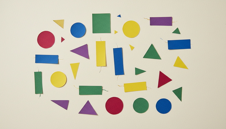
Repetition turns chaotic when it lacks variation or rule
Repetition can create unity. It can also create visual static. The difference lies in whether the repetition has a readable rule.
Rows, grids, marks, dots, textures, and motifs all ask the viewer to detect pattern. If the pattern is too rigid, it may become dull. If it keeps changing without logic, it becomes disorderly.
The most stable repetitions usually include both consistency and controlled change. A series of marks might repeat in size but shift in spacing. A set of shapes might share a color but rotate gradually. A pattern might break once to create emphasis.
Chaos enters when repetition gives mixed signals. The eye starts searching for an order that never arrives.
If a repeated element feels messy, define the rule. Then decide where to follow it and where to break it. A deliberate break can be powerful. A random break often looks like a mistake.
Ambiguity becomes chaos when forms cannot be identified or grouped
Not every work needs recognizable objects. Abstract work can be deeply ordered. Still, the eye tries to group visual information. It looks for families, boundaries, figure and ground, and relationships.
A work may look chaotic when the viewer cannot tell:
Which forms belong together
Which shapes sit in front or behind
Where one area ends and another begins
Whether marks are texture, shadow, object, or background
This is not the same as mystery. Mystery keeps the viewer engaged. Confusion blocks entry.
Grouping can solve much of this. Similar colors, shared edges, aligned centers, repeated curves, or common textures can help the eye organize parts into sets. Once the viewer can group elements, complexity becomes easier to read.
Edges cause disorder when everything is equally sharp
Edges control attention. A sharp edge feels immediate. A soft edge recedes. A broken edge invites movement. If every edge is equally sharp, the work may feel cut up into fragments.
This happens often in highly detailed work. The maker carefully defines every form, but the result becomes brittle. Nothing breathes. Nothing recedes.
Edge variety creates depth and calm. Keep sharpness where the eye should focus. Soften, lose, or simplify edges elsewhere. Let some transitions blur or merge. The viewer does not need every boundary explained with the same force.
Clarity often comes from deciding what not to define.

The simplest test is to remove one trigger at a time
A chaotic work does not need to be stripped of energy. It needs a clearer set of conditions. Before removing content, identify the visual trigger that creates disorder.
Start with these questions:
What is the first thing the eye sees?
Where does the eye go next?
Which area is competing too strongly?
Which gaps or tangents feel accidental?
Which repeated elements lack a rule?
Which edges are too equally sharp?
Change one condition at a time. Lower a contrast. Move a shape. Simplify a cluster. Soften an edge. Reduce a color’s saturation. Then look again.
A work looks chaotic when hierarchy, direction, contrast, spacing, repetition, grouping, or edge control breaks down. Once those triggers are named, they can be excluded with care. The goal is not to make the work quiet. The goal is to make its energy readable.
The same hand behind the paintings works in mulberry silk under the Chiqui Rodriguez Studio seal. Pre-order at chiquirodriguez.com/studio.